Designing Learning Paths for a Learning Platform
Summary
As a Learning Experience Manager, I set up and led a cross-departmental initiative to transform our complex digital learning platform into an intuitive learning path system, collaborating with UX designers, SMEs, and developers.
Responsibilities: Instructional design, LXD, project management
Target audience: online students
Tools used: miro, figma, internal learning platform, confluence (for project documentation)
Instructional design method: SAM
Employer: International University of Applied Sciences
Problem Statement
As a Learning Experience Manager at an educational institution, I identified challenges with our digital learning platform. Through student feedback and usage analytics, we discovered that learners were struggling to navigate through their courses effectively. The existing platform had complex navigation paths, ambiguous instructions, and a disconnected learning experience that left students feeling frustrated and unsupported.
Solution
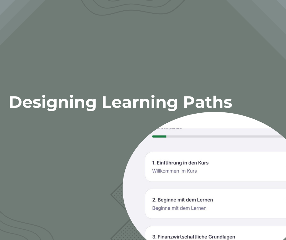
Taking on dual responsibilities as both Instructional Designer (Learning Experience) and Project Manager, I initiated a cross-departmental collaboration to improve the learning experience. Working with UX designers, Subject Matter Experts (SMEs), and developers, we designed and implemented a more intuitive learning path system.
Process
Preparation & Analysis
We began with a thorough needs assessment to understand student pain points:
- Analysed NPS and Feedback dashboards
- Conducted student interviews and surveys to gather specific feedback about their learning journey
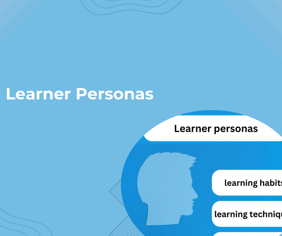
- Created user personas and journey maps to visualise student struggles
- Documented key barriers: unclear progression paths, complex navigation, and ambiguous instructions
Iterative Design Phase
Round 1: Initial Design & Rapid Prototype
- Collaborated with SMEs to map content into logical learning sequences
- Worked with UX designers to create wireframes showing clear progression paths
- Developed a basic prototype focusing on navigation and instruction clarity
- Conducted initial testing with a small student group
- Gathered feedback: students liked the clearer structure but needed better progress indicators

Round 2: Design Refinement
- UX designer enhanced the visual hierarchy and added progress tracking features
- Improved instructional copy to be more action-oriented
- Added visual cues to show completion status
- Implemented contextual help features
- Testing revealed improved understanding but highlighted need for better milestone indicators
Round 3: Final Iterations
- Added milestone celebrations and progress summaries
- Final user testing showed significant improvement in navigation confidence
- Made final adjustments to visual elements and instruction clarity
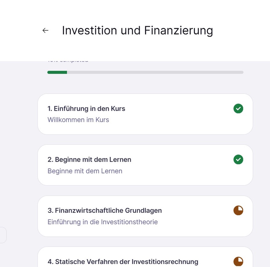
Implementation & Results
- Received approval from program leaders after demonstrating improved user experience
- Conducted pilot program with one course cohort
- Gathered positive feedback about clearer progression and easier navigation
 |  |
